Website critique - Lulu Allison
Lulu Allison is a Lounge Author member and last week we had an expert Q&A with Simon Appleby from Bookswarm on what makes an effective author website. Lulu has kindly agreed that I can critique her current website. I'm posting this to share best practice and encourage comments. Here is Lulu's home page.

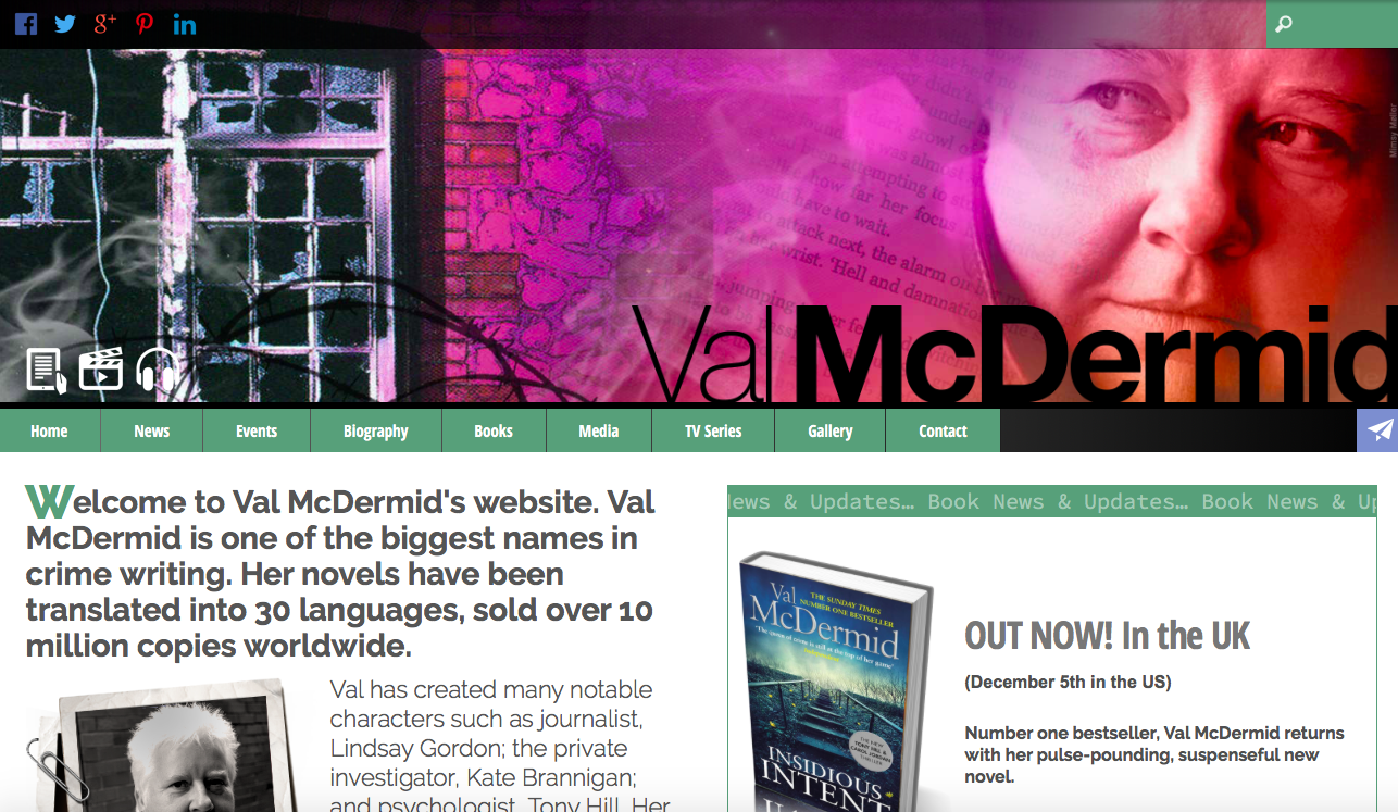
Worth explaining that Lulu is a debut author and her book Twice The Speed of Dark was published by Unbound in December. The image you see here is the amount of Lulu's home page I can see on my laptop. It isn't immediately clear that Lulu Allison is an author. This first impression needs to say you're an author, what sort of books you write and be extremely clear how they can find out specific information about you. It needs to visually represent you, call it aesthetics, branding or what you will. Here are two examples that do exactly that.

DO NOT make your visitors work hard to find out about you. You should have images of your book(s), you, an explanation of who you are and very clear navigation around the site.
Lulu - I would recommend you move your book image up (perhaps changing where the navigation is) and incorporate your photo and the elements from your About page. Move or remove your tagline - Happenstance and Holy Smoke - as it's one of the first things you read and it doesn't explain who you are or what you do.
The home page also needs a very clear Call To Action. Someone has landed on your website, now what are you going to do with them? You should encourage as many visitors as possible to sign up for your newsletter, preferably in return for a free ebook, novella, poem, advice, something of value.
Lulu - your 'You can sign up for my occasional newsletter here' is simply not strong enough. This needs to be front and centre and preferably visual. Plus, I'd recommend a pop up on the site too for grabbing email addresses. Here's an example from author Rose Sandy's website.

In terms of working out what the essential areas of your website are, first think through why people are visiting your site. At the very least they have come across you somewhere and they want to find out more. They are definitely interested in you, so have real value. (If you have any mechanism to ask your visitors why they've come to your website - eg through your newsletter list, then great, or look at your Google Analytics and see which pages are visited most - and build on those areas).
During our expert Q&A session with Simon Appleby of Bookswarm, he said that he considered the basic navigation that every author's website should have were:
- About me / biog
- My books
- News
- Events (sometimes combined with news)
- Blog
- Contact
and I agree, this is absolutely the starting point. There is plenty more you can layer on, but definitely start with these. Assume most people will visit your home page and leave or click on one or two links. Your home page MUST WORK VERY hard for you, so don't waste this opportunity.
In terms of the News section, if you don't have a steady flow of news, and quite frankly most of us don't, then I'd remove this or incorporate news in the sidebar.
Lulu - I would remove your news section for that reason. Also, when I clicked on My Reviews, I assumed these were going to be reviews of your book and not the reviews you've given to other books. I would place reviews of other books into your blog. My thinking here is a blog should express more about you, your passions, your writing, hobbies etc - reviews of other books sit very happily here.
Of course, if YOUR book has been reviewed, put the best quotes on your home page. Lulu, you have a fantastic quote hidden in your press release.
Which leads me to your page about your book, which is a press release. Not very user-friendly at all. As you only have one book, I would assume everything they need to know about your book can be on the home page - but add a 'Download the press release' somewhere just in case this is of interest. When you have more books add a 'My Books' section. You can then incorporate a page like Malorie Blackman's here.

To summarise my recommendations to improve Lulu Allison's website:
- Home page
Change the look and feel so it reflects you as an author. Move your book up, add quotes and some blurb. Include your photo and some information about you from your About page. Remove your tagline or use it somewhere else.
Add a call to action - grab your visitor's email address where possible. (Add a pop up too).
- About
A lot of this is now on the home page - so I would combine About/Contact
- News
Remove page and make sure your news appears either in your sidebar or in your Twitter feed.
- Twice the Speed of Dark
Most of this is now on your home page with a 'download the press release' link added. When you publish more books change this to 'My Books'
- My Reviews
Include in your blog
- Contact
This is now About/Contact - some blurb about you and your book and your contact details. I find contact forms off-putting - so why not set up a generic author email and provide it instead.
You also have lots of weird Wordpress links at the bottom of your site - Blog Roll etc - Remove all of them.
Another very important thing to consider is that your website is optimised for mobile. Lulu, check this as you redevelop your website. So, when someone lands on your home page, do the most important elements appear in the mobile version?
I hope that's useful. An author website certainly isn't THE most important element of a marketing platform, but it is something that you control and can work a lot harder for you (mostly through your newsletter list). As you become more well known and the number of visitors increases, more readers and potential readers will funnel into your newsletter list and you'll be able to build a meaningful and valuable relationship with them.
If you have views, especially contrary to mine, do comment. There certainly isn't only one way to do this.
Lulu updated her site based on these recommendations and it has improved significantly. The home page looks like this now.
